Knogin Brand Central
Your resource for our brand assets and guidelines. Let's build a consistent and powerful brand together.
Clear, Consistent, CyberEasy
Welcome to the Knogin branding portal. This site provides everything you need to represent our brand accurately and consistently. By following these guidelines, you help us strengthen our identity and mission to Secure Everything. Our brand personality is that of a young and dynamic expert in cybersecurity, aiming to be the "best friend" of an IT team by providing valuable, innovative, and creative solutions.
Logos
Our logo is the most recognizable element of our brand. It consists of a symbol (the minimalist abstraction of the letter 'K') and a logotype (the word "Knogin"). The logotype uses the Manrope (Semibold) typeface. Please use it consistently and correctly.

Primary Logo
For use on light backgrounds. This is the preferred version.

White Logo
For use on dark or colored backgrounds for high contrast.

Dark Text Logo
An alternate version for specific use cases on light backgrounds.
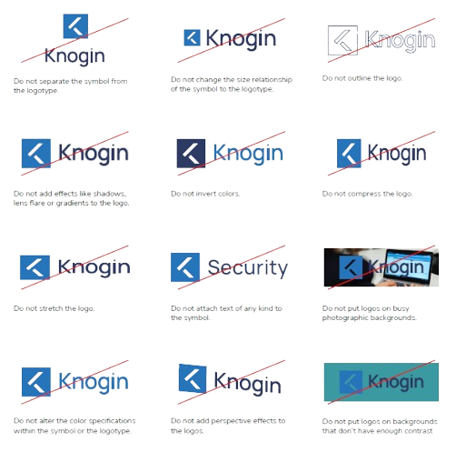
Logo Don'ts
To maintain consistency, do not alter the logo in any of the following ways:
- Do not separate the symbol from the logotype.
- Do not change the size relationship.
- Do not add effects like shadows, gradients, or perspective.
- Do not outline, compress, or stretch the logo.
- Do not put logos on busy photographic backgrounds or those without enough contrast.
Color Palette
Our colors are a key part of our identity, chosen to communicate a modern, stable, and serious image.
Master & Service Brand Colors
Strong Blue
#2674BC
Very Dark Blue
#2d3b64
Light Grey
#eaebed
White
#FFFFFF
Cybersecurity Report Colors
A designated color scale is used in cybersecurity reports to exemplify the severity of risk.
Blue
Green
Yellow
Orange
Red
Typography
The official typography for Knogin is Nunito Sans. This sans-serif typeface gives the brand a modern character and style. It is used for all internal and external communication. When applying typography, limit type sizes to three, keep it minimalist and simple, and use sentence case.
Headline 1
Headline 2
Headline 3
Body Text: Knogin enables businesses to be fully protected from cyber threats by deploying our Cybersecurity Suite, securing everything in the digital environment.
Small Text / Labels
Nunito Sans
Our official font family, available on Google Fonts. The font stack for the website is Nunito Sans, ui-sans-serif, and system-ui.
Available Weights:
- Aa ExtraLight
- Aa Regular
- Aa Semibold
- Aa Bold
- Aa ExtraBold
- Aa Black
Our Mission, Imagery & Icons
Our brand is more than just logos and colors; it's about our people, our mission, and the problems we solve with technical authority and professional confidence. Our imagery and icons reflect this mission.
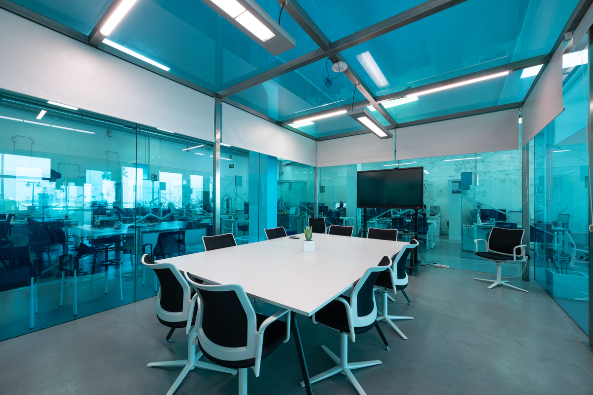
Photography: Be the Hero
We empower cybersecurity professionals to be the heroes of their organizations. Our photography should reflect this by showing diverse, real people in credible, collaborative situations. Images must have vibrant colors and good lighting.
Avoid: Fear-based imagery (hackers in hoodies), dark or mysterious device photos, and stock photos that feel inauthentic.

Professional & Secure
Our brand reflects the seriousness of our work. We provide Fortune 500-grade solutions that are accessible, reliable, and built on the latest technology. Our visual identity should always convey this sense of stability and innovation.
From our products to our presentations, every detail is crafted to inspire trust and confidence.
Icon Library
Icons are a key part of our graphic language, used to increase readability and aid interpretation. They should be styled in plain Knogin Blue in light mode, and white in dark mode. Do not overuse them or use them for decoration.
Our Trademarks
These phrases are core to our brand messaging. Use them to reinforce our mission and values.
Secure Everything™
Be the Hero™
Knogin™
CyberEasy™
Accessibility by Design
Building for everyone is a core part of our mission. Our digital products are designed to be inclusive and usable by people with the widest possible range of abilities. This is not an afterthought; it's a requirement.
Visual Accessibility
Our interfaces are built with visual clarity in mind. This includes the controls in our header, which allow users to select a high-contrast theme or adjust font sizes to their needs.
Keyboard Navigation
All interactive elements must be reachable and usable with the keyboard alone. We never hide the focus outline, ensuring that keyboard users can clearly see where they are on the page. This is crucial for users with motor disabilities.
Accessible Typography
We use clear, legible fonts like Nunito Sans. We also provide an option to switch to OpenDyslexic, a typeface designed to increase readability for users with dyslexia. You can toggle this using the glasses icon in the header.
Semantic HTML
We use the correct HTML5 elements for the job (e.g., <nav>, <main>, <button>). This provides essential context to assistive technologies like screen readers, allowing users to understand the page structure and navigate efficiently.